Branding Case Study
KOREAN AIR
Korean Air is interested in selling its image as much as its service. Unfortunately, the airline's current logo is outdated and heavy. It also reminds people of the Pepsi logo, which does not distinguish Korean Air as its own brand.

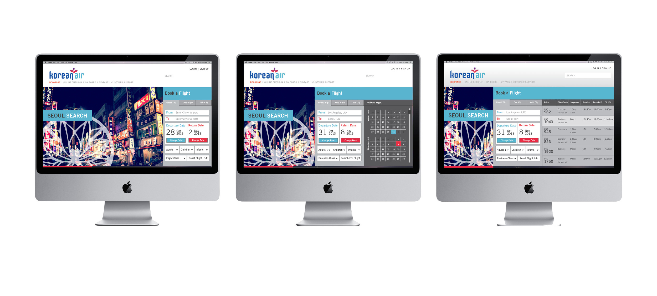
This re-design uses vibrant colors and contemporary typography and symbolism to make it more relevant in a world that has greatly transformed since the making of the original identity.


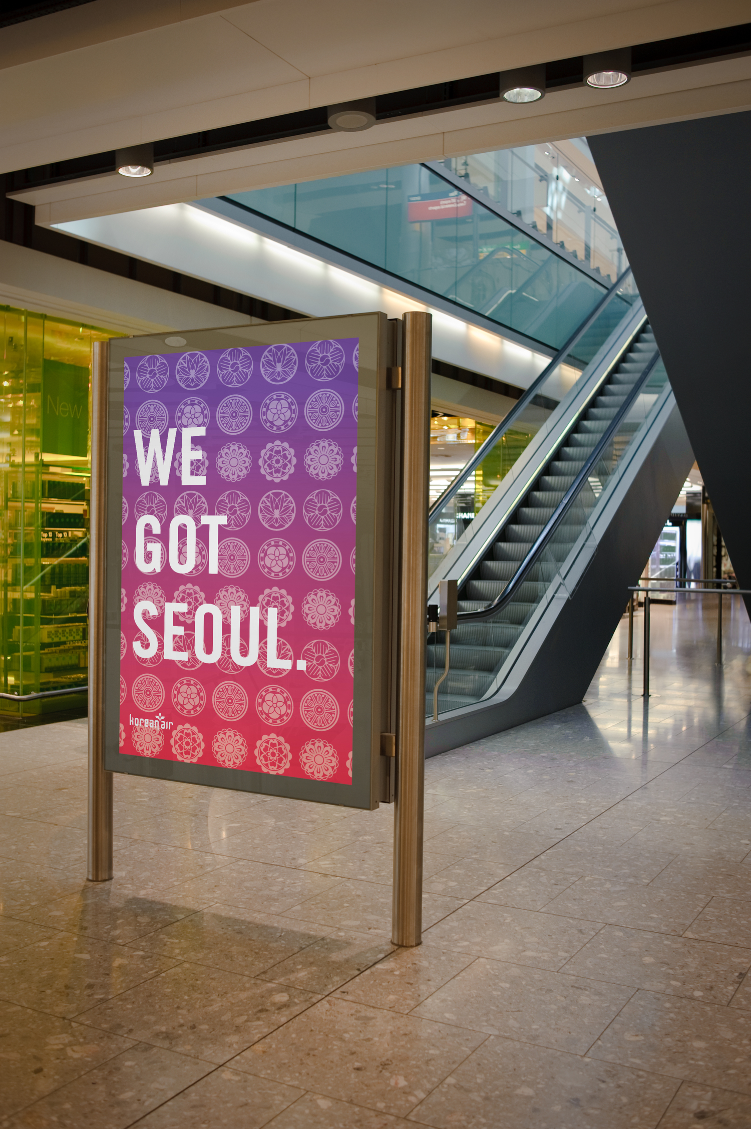
"We Got Seoul" gives Korean Air a new personality through messaging and overall look. It redirects the brand to a more youthful, but still professional flyer.


Boarding Pass and sleeve


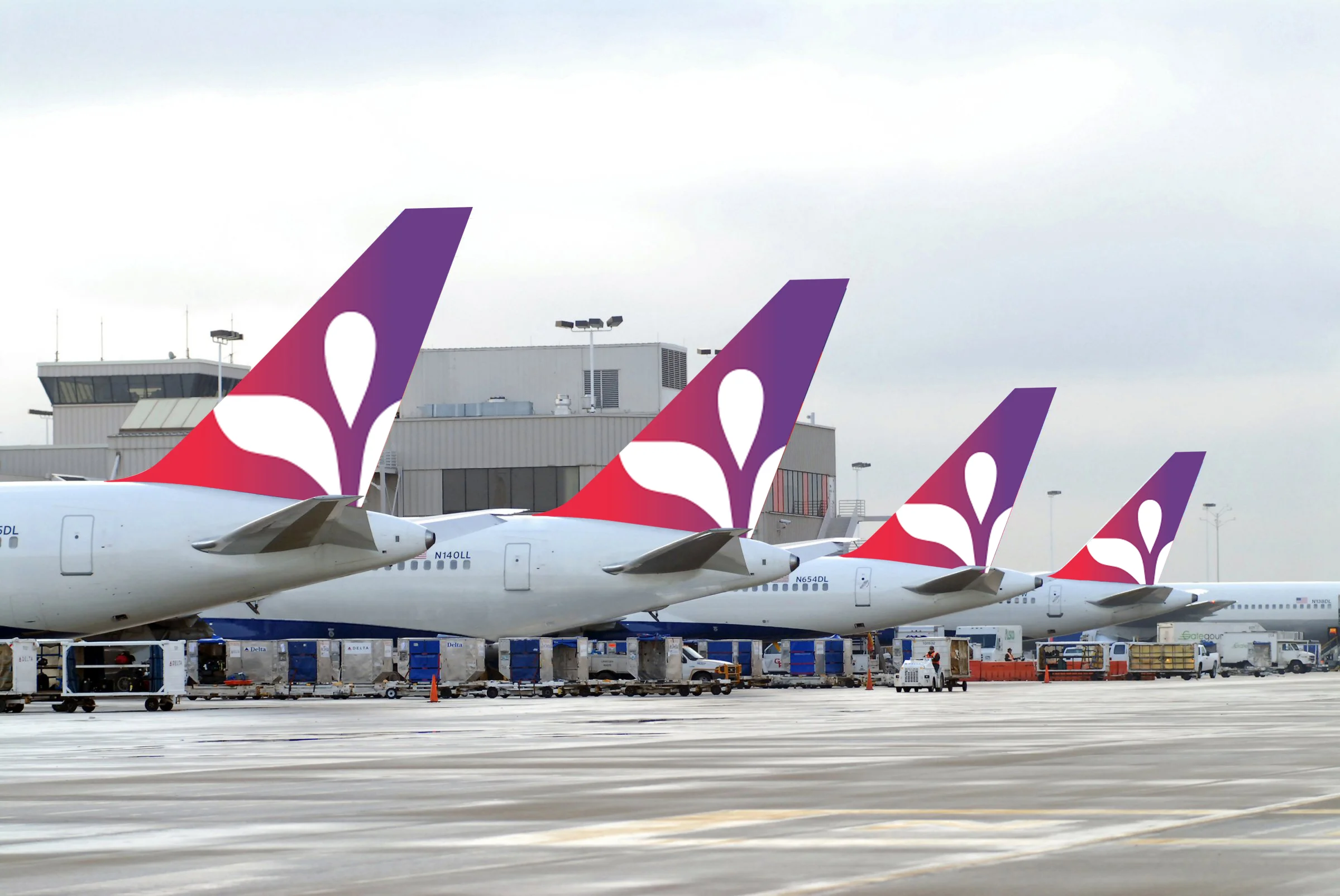

The airplane livery celebrates the brand and culture with its use of colorful gradients and large, visible symbols that can be seen in the sky.